Calligraphic Styles
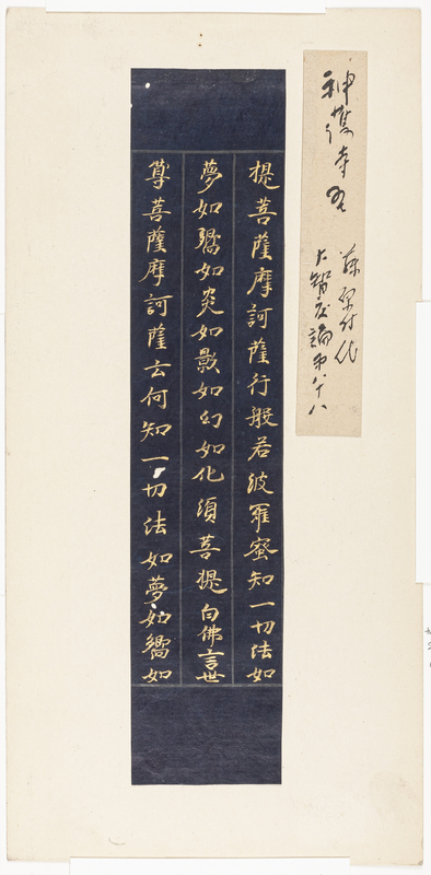
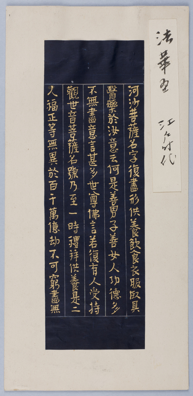
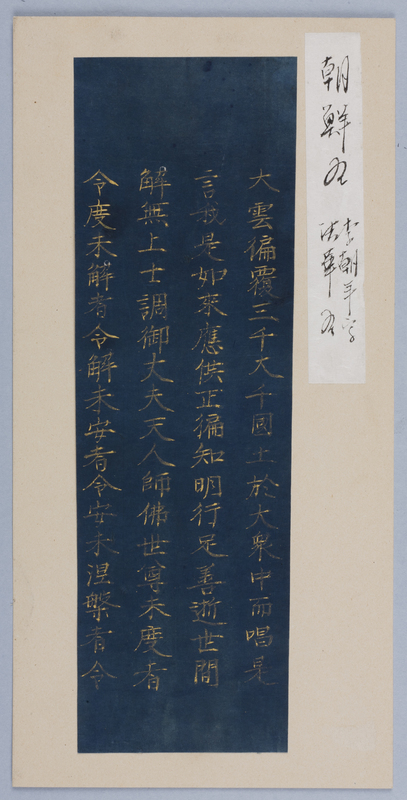
One significant characteristic of the JSMA set is that it includes eight fragments with gold or silver calligraphy on indigo-dyed paper from both the Korean peninsula and Japan.
The Japanese examples range in date from the Heian to Edo periods, making it possible to consider the commonalities and differences in the quality of paper and pigments, and calligraphic styles within this same general format.
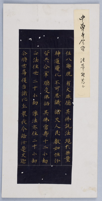
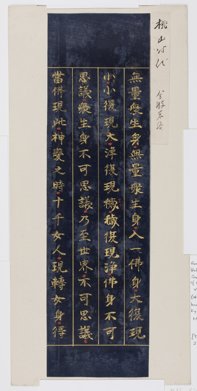
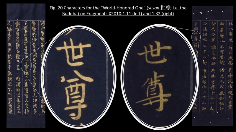
For example, let’s look at X2010:1.32 and X2010:1.11 a little more closely (Fig. 20, see image below). The two copies are both done in gold pigment on indigo-dyed paper ruled using silver pigment. X2010:1.32 is from the Heian period, while X2010:1.11 is from the Edo period. Gold inscription on indigo-dyed paper remained popular throughout the history of scriptural copying in Japan, particularly since the Heian period. Following the convention of sutra copying established in the Nara period, in both examples, each line transcribes about seventeen characters.
Beyond these commonalities in format, however, the two examples demonstrate some significant differences in calligraphic style. The Heian-period fragment exhibits fast yet controlled strokes produced by a trained and accomplished hand. Although the characters become progressively smaller and somewhat squished toward the bottom of a line, evidencing an effort to squeeze in the standard seventeen characters, each character is in balance: a slight vertical incline of the horizontal line is matched by the sharp downward pull of the vertical and diagonal strokes or the slight pooling of pigment at the end of a stroke. This balancing act is producing an overall effect of rhythm and harmony.
The Edo-period fragment, on the other hand, is much more uniform in terms of the spacing of characters in a line. However, compared to the Heian-period counterpart, there is an undeniable awkwardness in the movement of the brush and a sense of imbalance in the size and form of the characters. The characters are generally top heavy, and they seem to oscillate side to side along the vertical axis. A comparison such as this one provides a perfect gateway into conversations concerning the potential difference in the identity of the two calligraphers, but more generally on the changes that took place in the social structures surrounding Buddhism between these two periods.
Gold pigment is produced by mixing powdered gold with animal glue called nikawa 膠. It is thicker in consistency than regular ink, making it much harder to write with. The Heian-period fragment exhibits the popular calligraphic style of the period, and the quality of lines is virtually indistinguishable from any calligraphy done in black ink. This suggests that the inscriber was not only an accomplished calligrapher, but experienced in writing in gold.
According to the identification slip, the Heian-period piece was part of the “Chūsonji sutra” (Chūsonji-kyō 中尊寺経), commissioned by either the son or grandson of the powerful warlord Fujiwara Kiyohira 藤原清衡 (1056-1128). The son, Motohira 基衡 (d. circa 1157), donated one thousand copies of the Lotus Sutra composed in gold characters on indigo-dyed paper in commemoration of his father’s death, while his grandson, Hidehira 秀衡 (d. 1187), commissioned a copy of the entire Buddhist canon (issaikyō) also in gold on indigo-dyed paper. The two sets of sutras were both donated to the temple, Chūsonji, built by Kiyohira in 1105. Given the prestige of these projects, it is understandable that the most accomplished calligrapher(s) of the day would have partaken in the actual scribing. Although we do not know the exact provenance of the Edo-period piece, the disconnect between the expensive materials used in this fragment and the relative lack of skill in its calligraphy betrays that this was a project of a more private nature.
